This was a tough project, because Polaris wanted to promote both their products and their compatibility with tools electricians use all fit into a small banner ad space. The project was split into a prospecting ad set and a retargeting ad set featured on Google and LinkedIn.
POLARIS AD CAMPAIGN
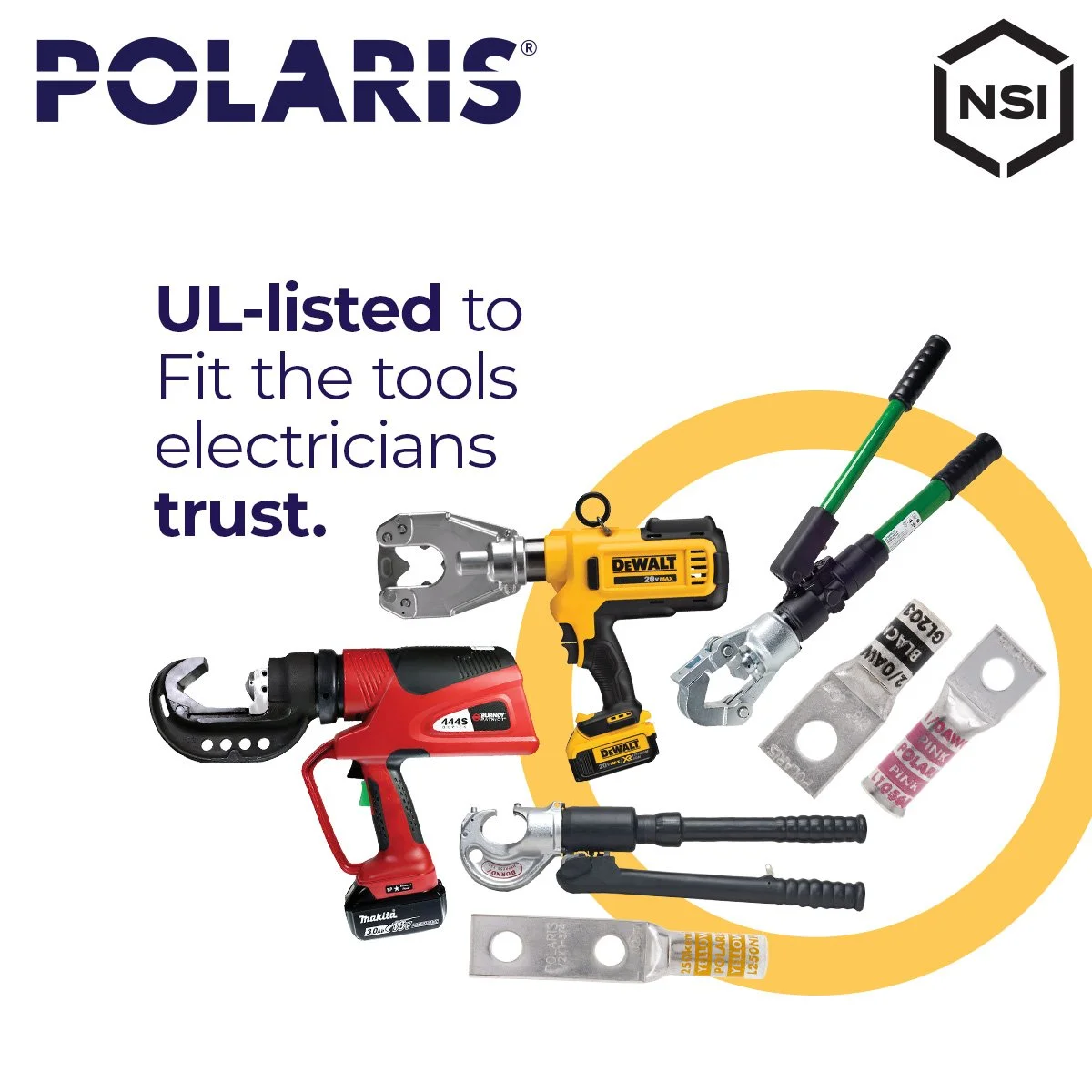
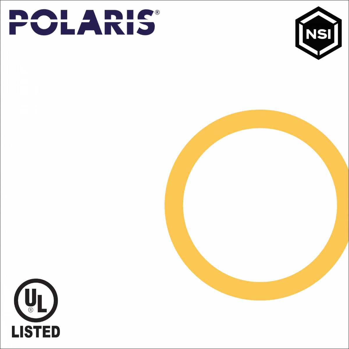
This ad group focused on grabbing the attention of new customers while delivering the message that Polaris products were UL-listed and compatible with all the different tools electricians use. Polaris usually uses a dark blue background in their marketing, but I wanted this ad set to stand out from the others to appear more inviting and professional; hence the clean, white background. I maintained enough brand identity to be identifiable with the yellow circle that resembles the connector holes found on most of their products.
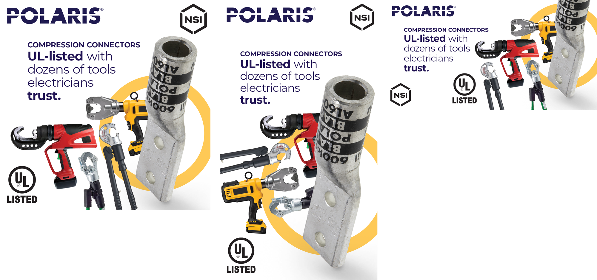
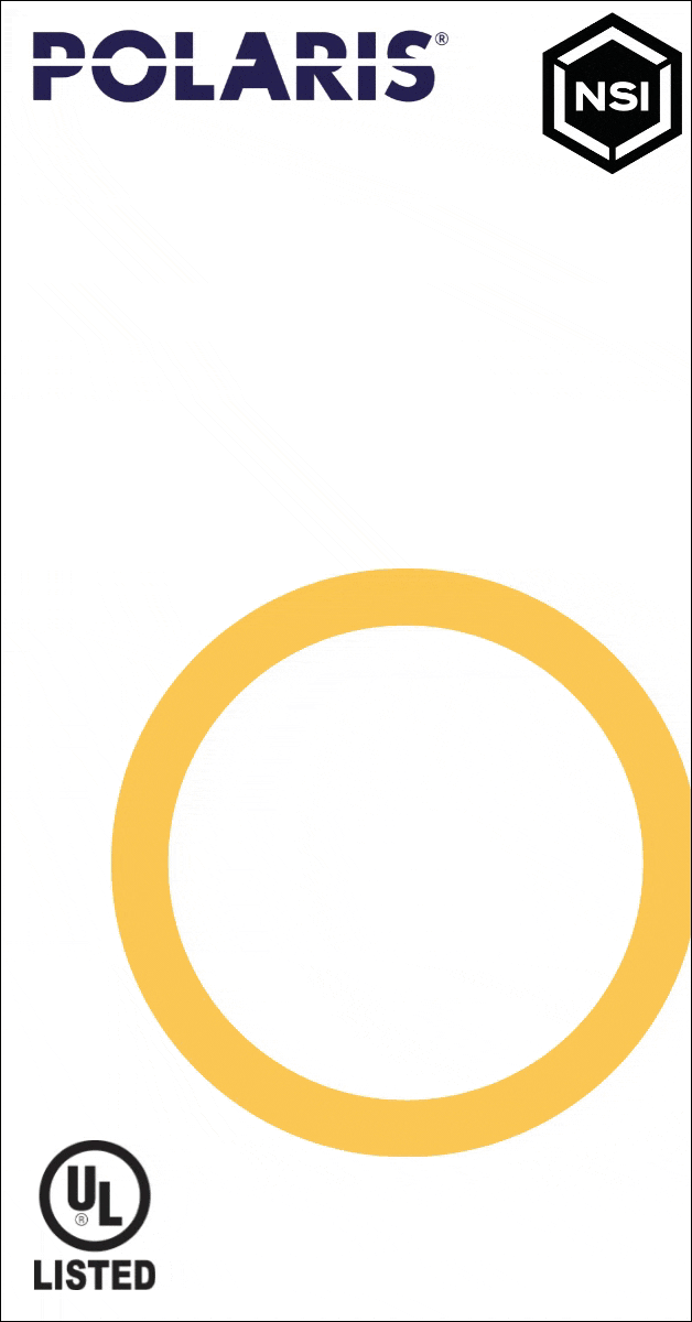
These first two designs were early drafts. The client loved the direction, but didn’t want only one tool shown to avoid favoritism. The second draft showed more tools mixed in with Polaris products, but the client wanted their products to be more front and center.
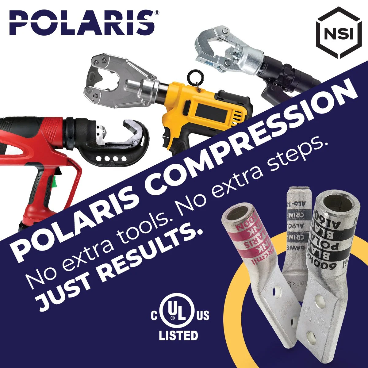
PROSPECTING SET

Below is the final ad set with multiple tools shown with the Polaris compression connector drawing the most attention.
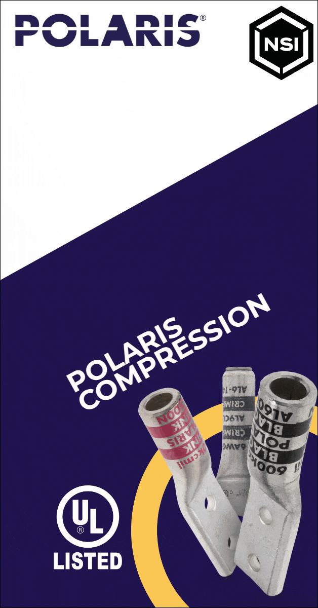
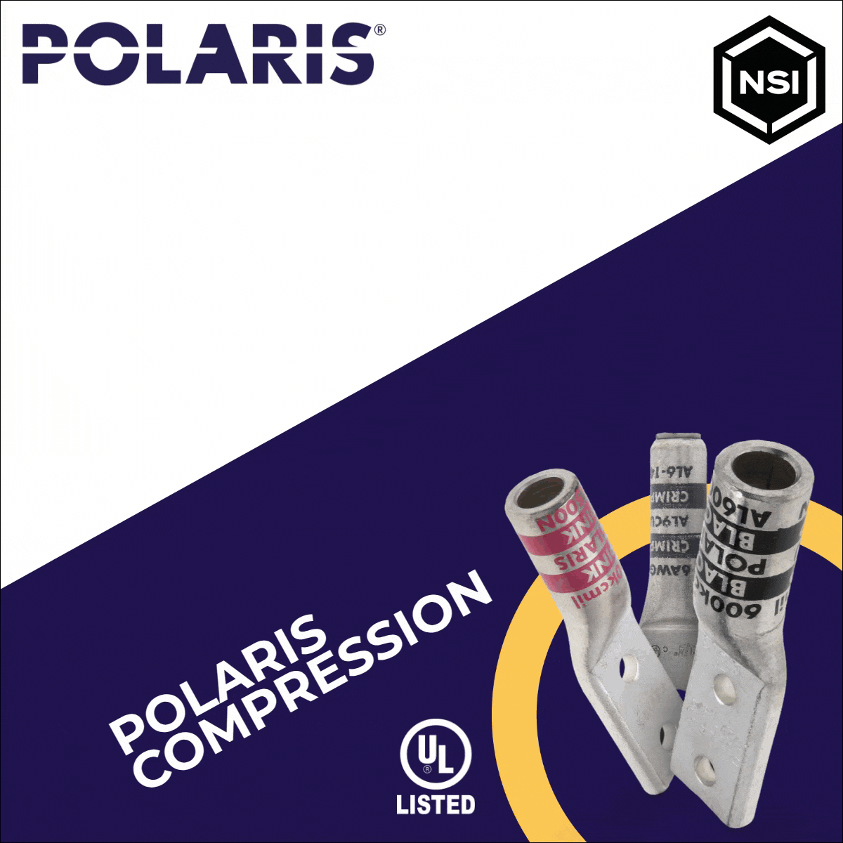
This ad set retargeted the same users who saw the prospecting version with a message that Polaris doesn’t require extra work or time on the electrician’s part. Unlike the prospecting set, I kept this design more in-line with the Polaris branding as seen with the slanted dark blue background. The angled text was used to generate more excitement and lead the eye from the tools down to the connectors at the bottom right.
The first design shown was an early draft that the client loved but thought the placement of the “Polaris Compression” text made it seem associated with the tools on top. I didn’t put up much of a fight, because I agreed.
RETARGETING SET
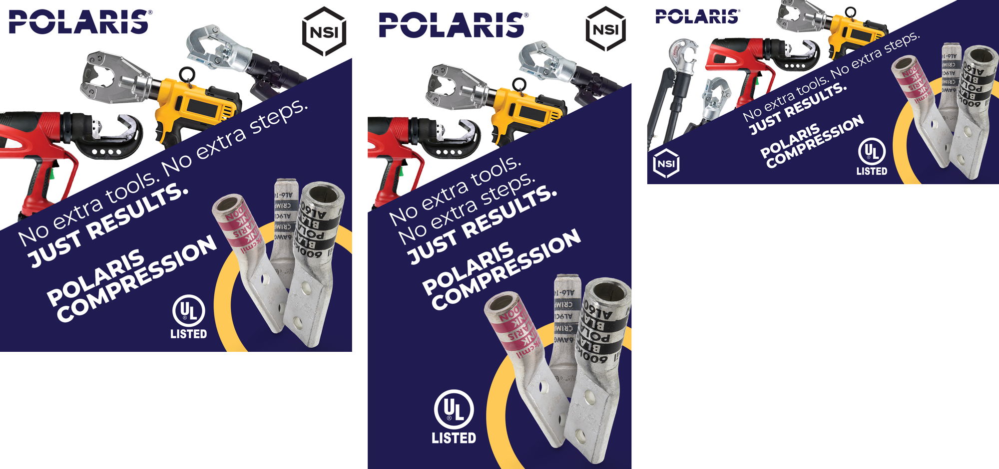
Below is the final ad set with the reordered text.